

At the beginning of 2022, we get to validate our senses with the Color of the Year delivered by Pantone, like every year. This year, a brand new color was invented rather than picking an existing one from the chroma. A delicate shade of “dynamic periwinkle blue hue with a vivifying violet-red undertone” called Very Peri is the Pantone Color of the Year 2022.
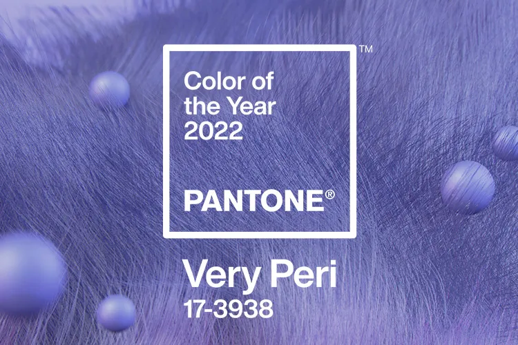
Embracing an altered landscape of possibilities, opening us up to a new vision as we rewrite our lives, PANTONE 17-3938 Very Peri displays carefree confidence and daring curiosity to animate our creative spirit.
PANTONE 17-3938 Very Peri symbolizes the spirit of the moment and the transition we are going through. It illustrates the fusion of modern life and how color trends in the digital world manifest in the physical world & vice versa.
Thinking of which tickles our mind with a query,
What made Pantone invent a new color for the hue this year?
Very Peri being a combination of violet-red undertones and blues reveals the transformation of the physical and digital world. This significant makeover now makes its appearance following the global quarantining, isolations, and lockdowns signifying that the digital world has taken a new place in our lives.
This color has made a significant abode in the designing industry, be it in the fashion world, home decor, interior designing, automobile, or the textile industry.
Making its steps to meet the digital world, GBSL aims to bring this diversified chroma of tint into business by offering varied undertones of General Merchandise, Home Decor, and Seasonal decor adjoining the Pantone’s creativity.
While most color companies announced a shade of green color for the year 2022, PANTONE made a new shade – “VERI PERI”, and it blends the faithfulness and constancy of blue with the energy, power, and excitement of red.
GBSL carries the idea behind this hue and acknowledges the product plan to design briefs, concepts, and products, showcasing an upbeat attitude and encouraging courageous creativity and imagination through its small attempt.
Let’s watch this out with a different perspective of how the Very Peri shade incorporates our lifestyles.
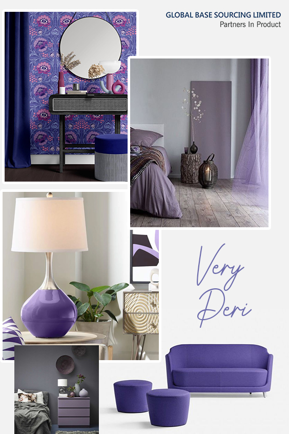
Intermingling Very Peri to our Homes
Very Peri allows designers to show their creativity in every possible term they want. In the sphere of home decor and interior designing, creators get a wide array to experiment with their thoughts to bring into reality.
This shade of Very Peri is accessible easily to compliment your Kitchen Cabinets, Living area, Bedroom walls, Office Space, Household Decorative items, etc.
With some fair efforts to infuse your home with a touch of Pantone’s Very Peri can bring a conventional module of artistry tinge and a chic factor.
GBSL brings its high-toned decorative abstractions to combine with this new invention (PANTONE 17-3938) and delivers superior and up-to-date designs meeting the market requirements.
Complimentary Colors to Very Peri
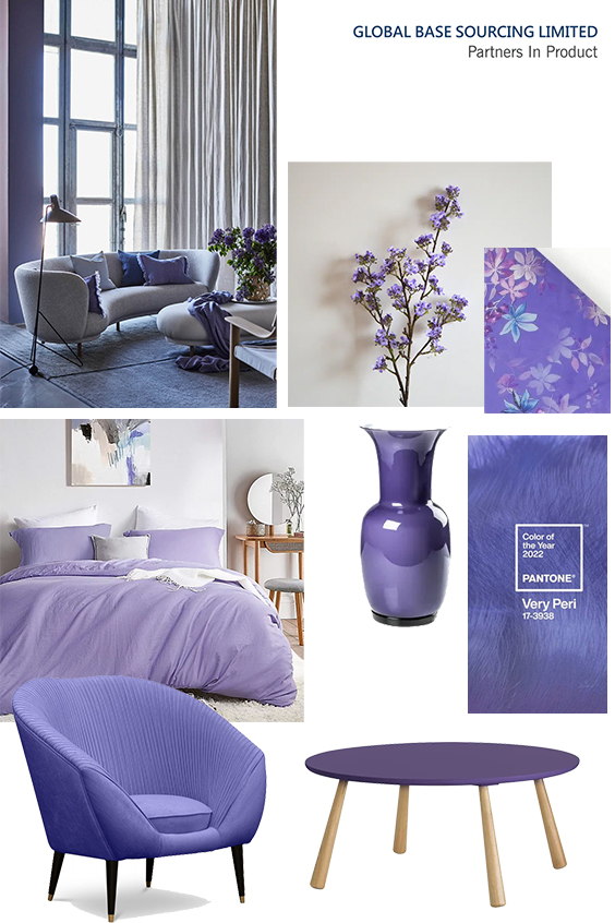
Very Peri has a wide synergy to counterpart all your moods, aura, and requirements. This is the best part of this hue, as it matches up with every vibe and spirit, flattering all colors of the chroma.
Specifically- tinges of gold, creamy whites, medium-toned beiges, and specific warm grays are best suited if you want to go with a little breezy vibe.
While, shades of green, teal, or turquoise blues can be endorsed best if you want your vibe to be catastrophic and gloomy.
A perfect shade of orange-red combined with Very Peri can never go off-track if you got a valiant spirit.
Materialistically-filled compartments with glass, golden or copper metal finish, and faux fur in Very Peri can bring your home to a dupe a sophisticated chic look at ease.
For bright and quirky hues, purple, teal, mustard, and creamy white are greatly paired with Very Peri.
For a real-time experience in safe yet sophisticated home decors, GBSL abruptly becomes a choice for all. GBSL coordinates and manages the complete supply chain to plan & deliver all products directly to your warehouse.
Conclusion
Very Peri, a color of eccentricity and utmost charm are what you need to keep calm and tranquilize your senses, matching your mood. This color can be used in patterns to bring an extensive change to your interior in a very subtle way. Adding florals and geometric patterns, and some authentic accessories can make your space appealing and fleek.
GBSL perceives Very Peri’s revival, rejuvenation, and energy in the products by creating synergy between the maker and market.

